

Every year, design holds up a mirror to culture, reflecting what we value, question and desire.
Packaging, once the silent salesman, now behaves like media. It speaks, senses and connects.
For FMCG and lifestyle brands, design is no longer surface decoration. It is data, emotion and identity woven into one system.
Design as a Cultural Interface
Design functions as an interface, more than an aesthetic. Packaging design translates values into visible behaviour. In a culture defined by noise, meaning is what cuts through.
Graphic Trends 2026:
At INTERCULT BRANDS, we see 2026 as the year packaging moves from beautiful to meaningful, linking technology, sustainability and cultural expression in ways that redefine relevance.
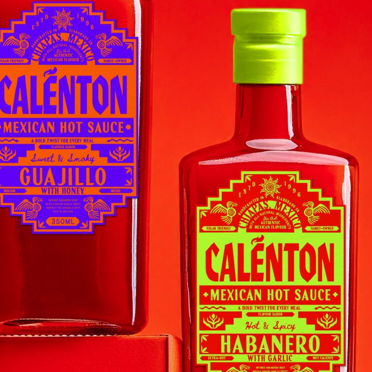
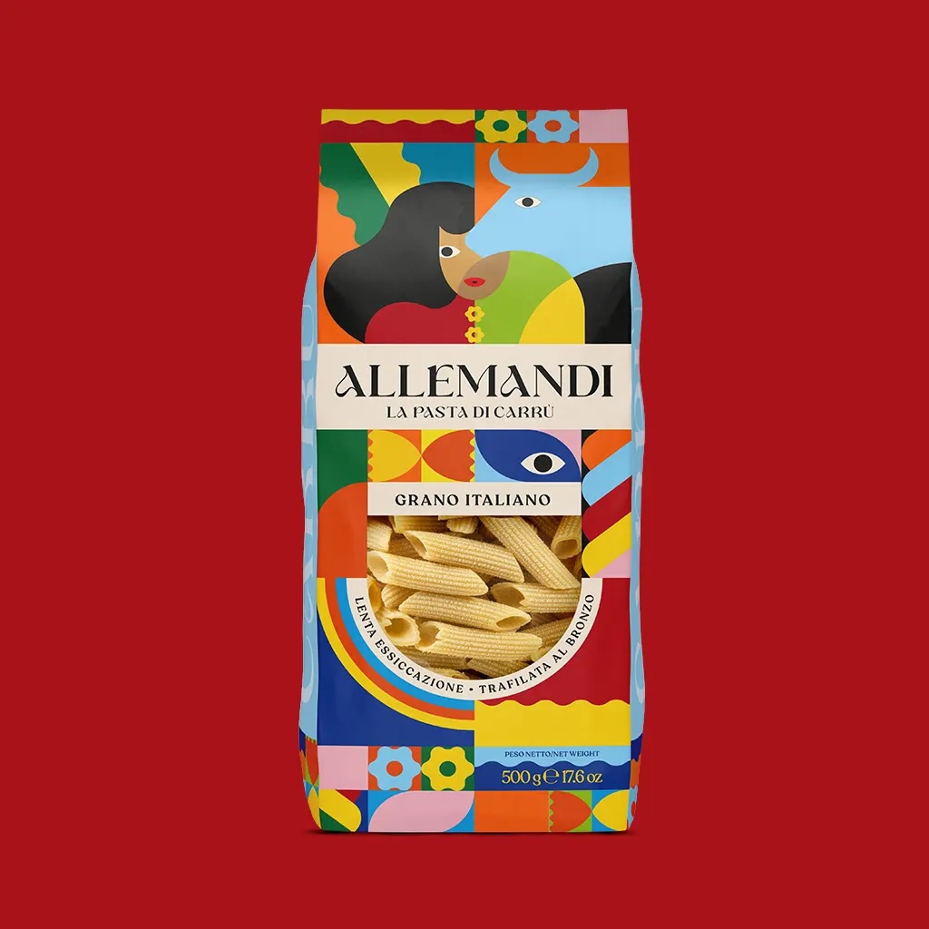
1. A cultural reclamation
In 2026, design moves beyond broad ideas of inclusion towards cultural provenance and identity art.
Expect a surge of culture-inspired packaging that borrows from local art forms, traditional patterns, regional languages and counter-culture ambassadors. Brands are increasingly commissioning illustration, pattern and calligraphic systems created by regional, indigenous or sub-community artists, bringing meaning into everyday products.
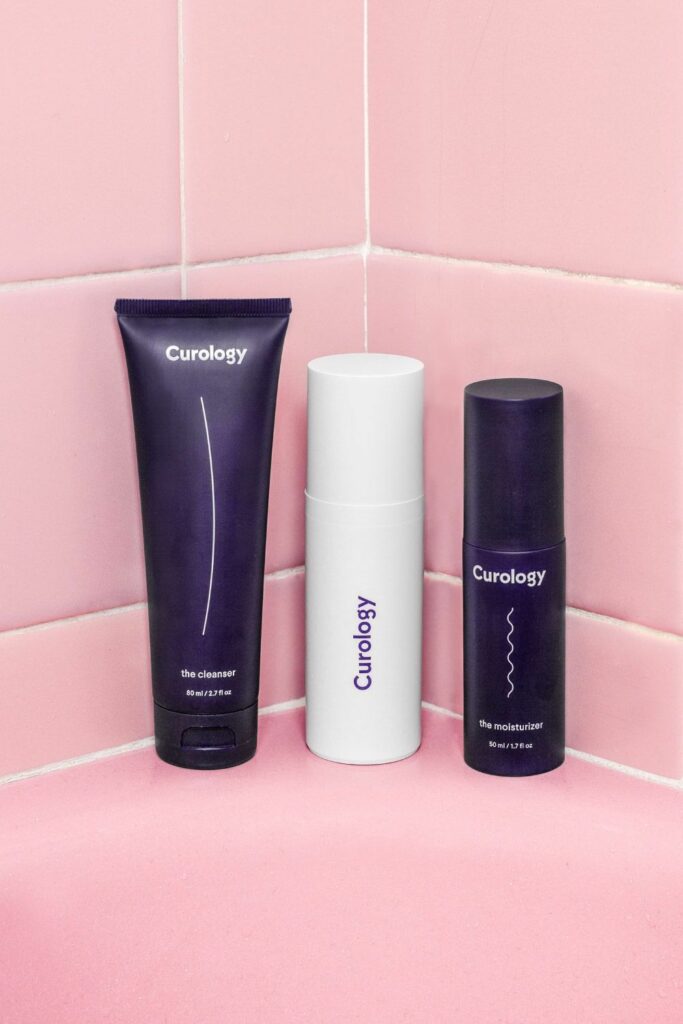
2. The quiet power move
When life feels overwhelming, calm becomes a competitive advantage.
Restraint reads as confidence. Brands are turning down the volume, using stillness to signal authority, care and control in an overstimulated world. Muted palettes, soft typography, tonal systems and generous white space replace visual noise.
Texture takes the lead. Embossed details, soft-touch finishes and uncoated stocks introduce tactility as reassurance, slowing the interaction and inviting touch.
Colour plays a key role. Pale neutrals, warm off-whites and powdery tones reflect a wider cultural shift towards editing, focus and emotional breathing space. Pantone’s Cloud Dancer acts as a cultural cue of restraint, the visual equivalent of a deep breath.
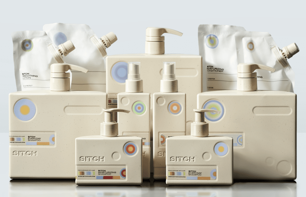
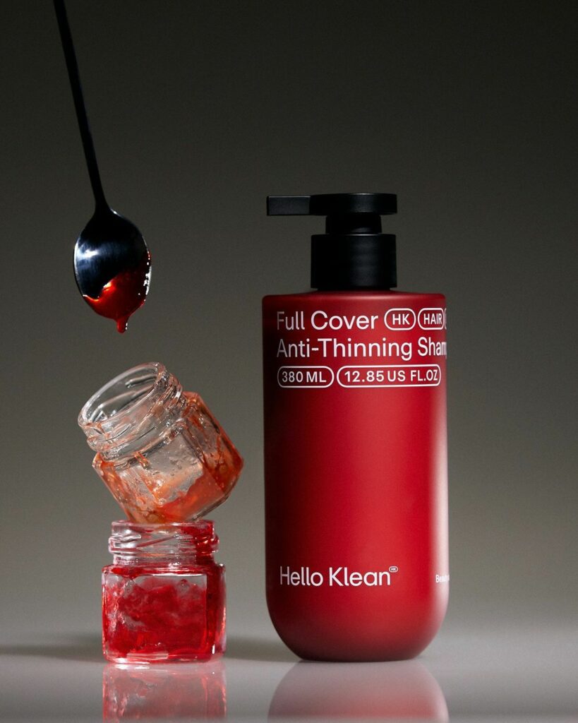
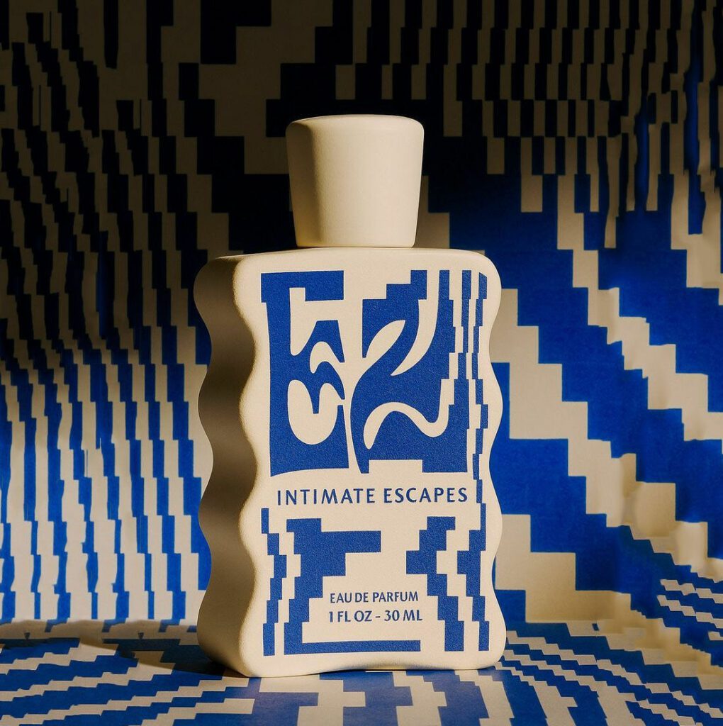
3. Science expressiveness
Science and futurism are no longer expressed through cold abstraction, warmth is added to the formula. Industrial minimalism and lab-led aesthetics are softened, to reflect precision without sterility.
A new subtrend of it is sci-fi with its Celestial and astral associations giving depth, reflection and luminosity while suggesting progress, exploration and possibility. The result is a future-facing design where science is quietly felt through surface, light and form.
Silver, chrome and pearlised whites rise as dominant colour cues of Science, joined by iridescent inks and subtle holographic finishes that shift with light and movement. These surfaces feel technical yet tactile, referencing innovation while remaining calm and controlled. But not only, colours took a stand within this trend and science could represent a much bolder vision.
Finally, the familiar apothecary codes, the origin of science, remain, but has evolved, less nostalgic, more informed, shifting from heritage reassurance to visual intelligence. A surviving subtrend.
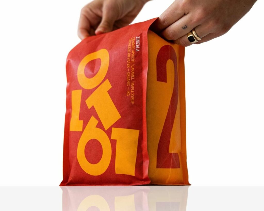
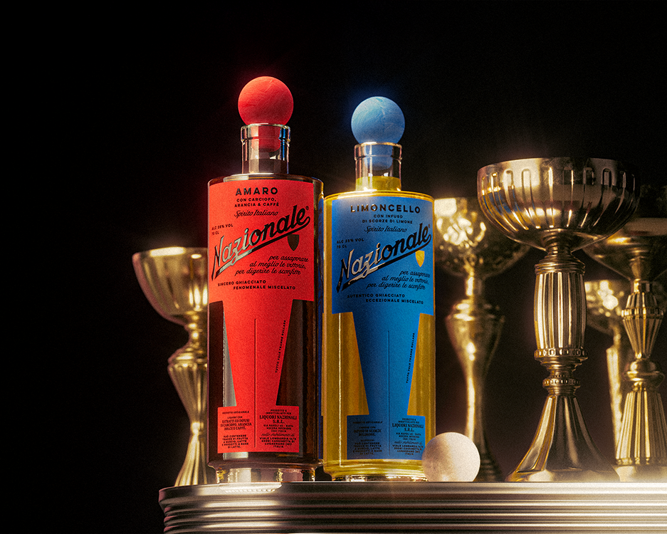
4. Turn the volume up
Alongside this quiet confidence, some categories deliberately move in the opposite direction: High-saturation colour, kitch graphics and bold contrast are used to spark energy, joy or urgency.
Boldness in 2026 is unapologetic and emotionally direct. Designers are leaning into saturated colour, high-contrast palettes and oversized graphic elements that demand attention on shelf. Gradients intensify, hues clash and form becomes expressive rather than polite. This is not excess for its own sake, colour is being used deliberately as a psychological cue, signalling energy, optimism or digital fluency in seconds.
In crowded categories, these vivid systems cut through instantly. When handled with confidence, bold colour becomes less about noise and more about emotional connection.
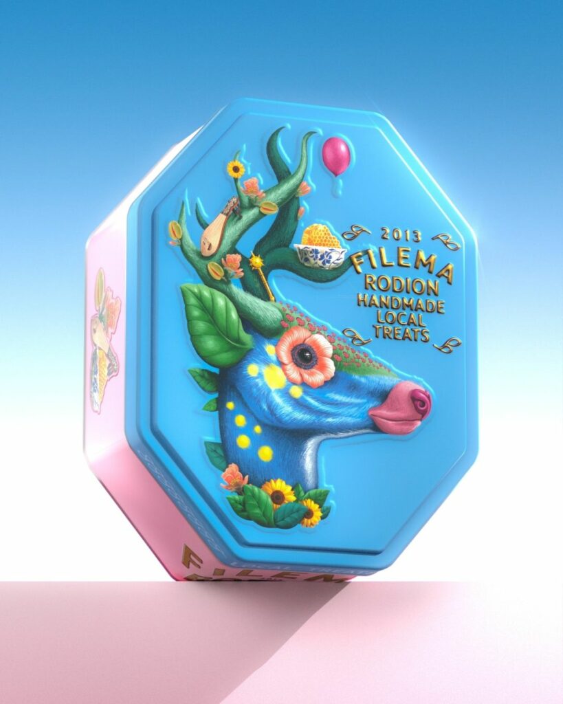
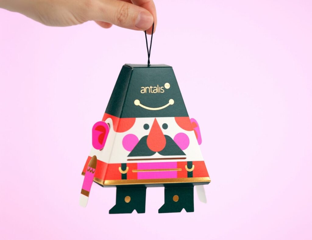
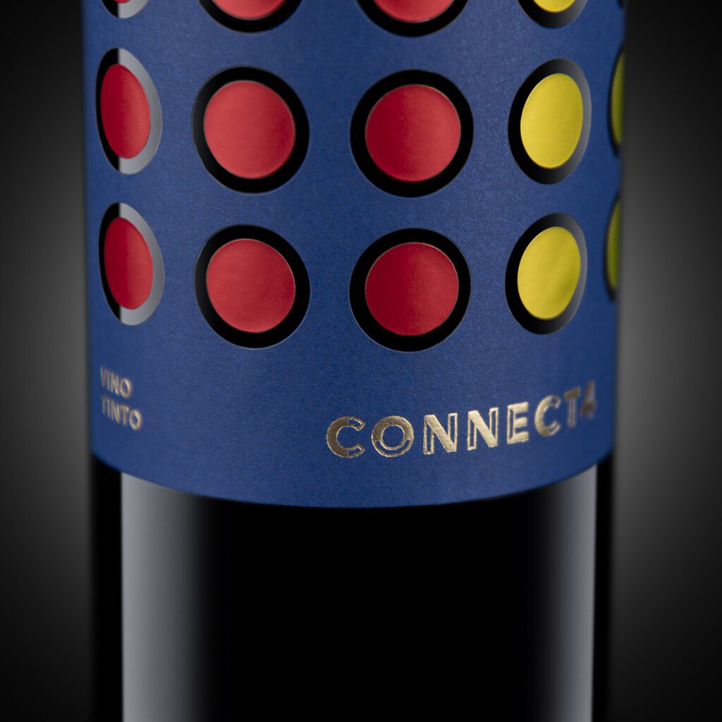
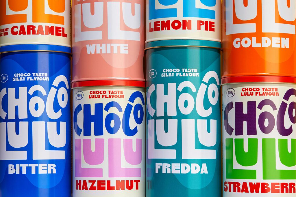
5. Let’s play
In 2026, packaging is designed as a playground. building in moments of interaction, surprise and light-hearted discovery. This playfulness shows up through two intersecting directions: gamification and regressive nostalgia that invites people to scan, touch, fold, build or collect.
Mascots and character systems are returning with purpose. Friendly figures, toy-like forms and expressive characters act as emotional shortcuts, giving brands a face, a voice and a sense of continuity & relationship across touchpoints.
For younger audiences, this kind of physical play activates imagination and sensory engagement. Playfuleness is not a gimmick, it becomes a value exchange , offering delight, memory and meaning.
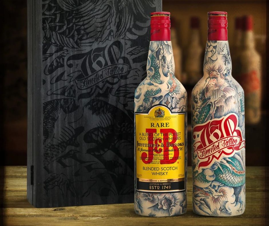
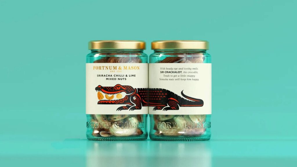
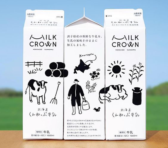
6. All over Storytelling
In 2026, packaging is no longer designed to tell a story from the front alone. Every side of the pack becomes a page, inviting people to turn, read and piece together meaning over time. Front-of-pack sets the tone, but the sides and back carry depth , illustration, pattern and detail unfolding as the product is handled.
At the same time, storytelling expands outward onto the shelf. Packaging is increasingly designed to perform collectively, not individually, forming modular systems that align, repeat and scale into bold visual narratives when placed together. Colour, form and graphic rhythm work in unison to create billboard-like moments that feel immersive, even with limited facings. The result is packaging that functions as both object and environment – part storybook, part stage – creating memorable brand worlds.
7. Say no more
Oversized wordmarks, expressive serifs, confident geometric sans-serifs and characterful handwritten styles, custom-built fonts become defining assets, replacing product shots & other flourishes. Spacing, proportion and movement matter as much as the words themselves.
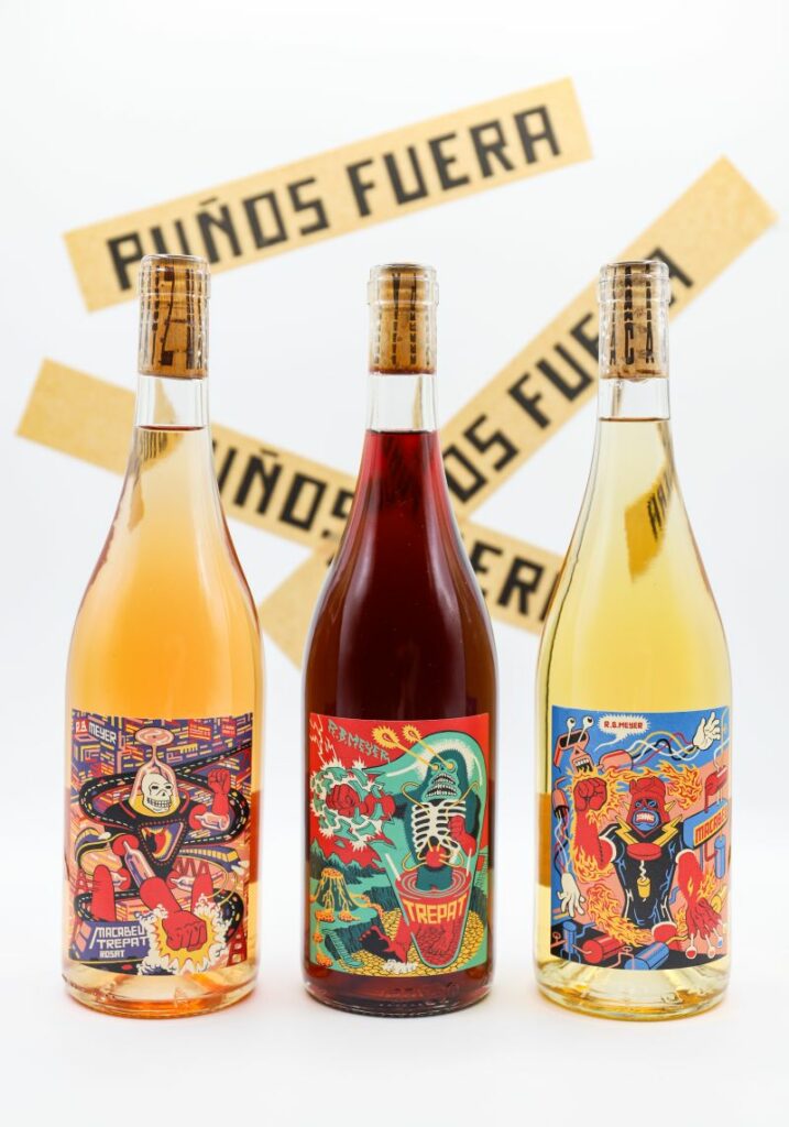
8. Chaos & Rebellion
As generative AI floods the market, unique human expression and unmistakably handmade visuals will become premium. imperfection is back, and it’s powerful.
Raw, imperfect, and deeply personal art will be celebrated . The “handmade” look becomes an act of rebellion .
Layouts experiment with fragmentation, distortions, collaged elements and unexpected alignments that feel raw and human. embracing noise, asymmetry and imperfect layering to signal personality and attitude. Typography might be jagged, irregular or seemingly mismatched; imagery can shift, overlap or break grid logic; colour and texture can clash in ways that feel immediate and alive.
A controlled chaos, where disruption becomes a tool to suggest speed, immediacy and cultural edge.
The 2024/2025 persistance
It’s also worth noting what hasn’t disappeared. Several packaging directions that emerged in 2024 and strengthened through 2025 (check the article: Insights from Pentawards festival 2025 ) are still very much present in 2026. That persistence is a signal in itself.
When trends endure beyond their expected cycle, they stop being trends and start revealing deeper cultural and commercial truths. Rather than chasing novelty, brands are refining what already works. We’ll be decoding these continuing design languages and the reasons they refuse to fade in a dedicated follow-up, because longevity often tells us more than disruption ever could.
Meaning for Brands: Culture Is the Competitive Edge
Trend reports are rarely about aesthetic. They reflect deeper values and design choices about how brands show up in culture and how consumers react to it (read the article “consumer behavioural trends “ https://www.intercultbrands.com/consumer-behavioural-trends-in-2026/)
In 2026, the brands that stand out will be those that treat packaging not as a finished object, but as a cultural interface , something that listens, responds and communicates meaning before a word is read. The tension between human and machine, digital and physical, global reach and local truth will continue to shape visual expression. Within that tension lies opportunity for storytelling that feels authored.
At INTERCULT BRANDS, we believe culture is not an accessory to design. It is the operating system behind it, shaping how people see, touch and ultimately trust a brand. We work with CPG brands to translate cultural intelligence into design systems that deliver relevance and competitive edge.
Culture is the future direction. And the brands that learn to read it … win.

One Response