Anyone who knows me in private will tell you that. And if we haven’t met yet, just look closer next time 😉 there’s always a strand of hair doing its own thing. Call it mastered flaws: they’re part of spontaneous me, as much as my discipline and high standards are at work.
Contradictory? Maybe. But that’s where the magic happens.
That’s why Wabi Sabi speaks to me. It’s a Japanese philosophy that says imperfection is beautiful and repair is something to celebrate. For CPG, this isn’t an abstract idea. It’s a design language, a cultural code, and a fresh way to talk about beauty & packaging (mostly !).
The aesthetic of the real, The tension that works
To understand Wabi Sabi, think in textures and silhouettes:
Raw materials: uncoated papers, Wood-like texture, clays with grit still in them.
Irregular silhouettes: bottles that aren’t perfectly symmetrical
Naturally distressed: scuffs, fades, patina and wear
Japanese repair codes and aesthetic techniques are powerful because they flip the script. Whatever is usually hidden, disposable, or over polished is now crafted, reused and embraced…all in all aligned with the craving for authenticity, meaning and sustainability.
That tension is what makes them powerful. They’re cultural signals that say: “We value honesty. We value care. We value things that last.” Wabi Sabi says: be real. Don’t fake perfection, let the cracks folds and show your character.
Fashion urban brands have built entire cult followings around this. To lesser extent CPG brands played it too.
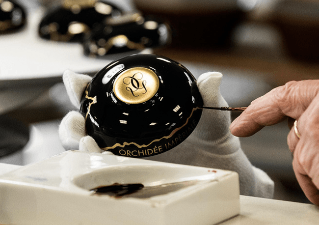
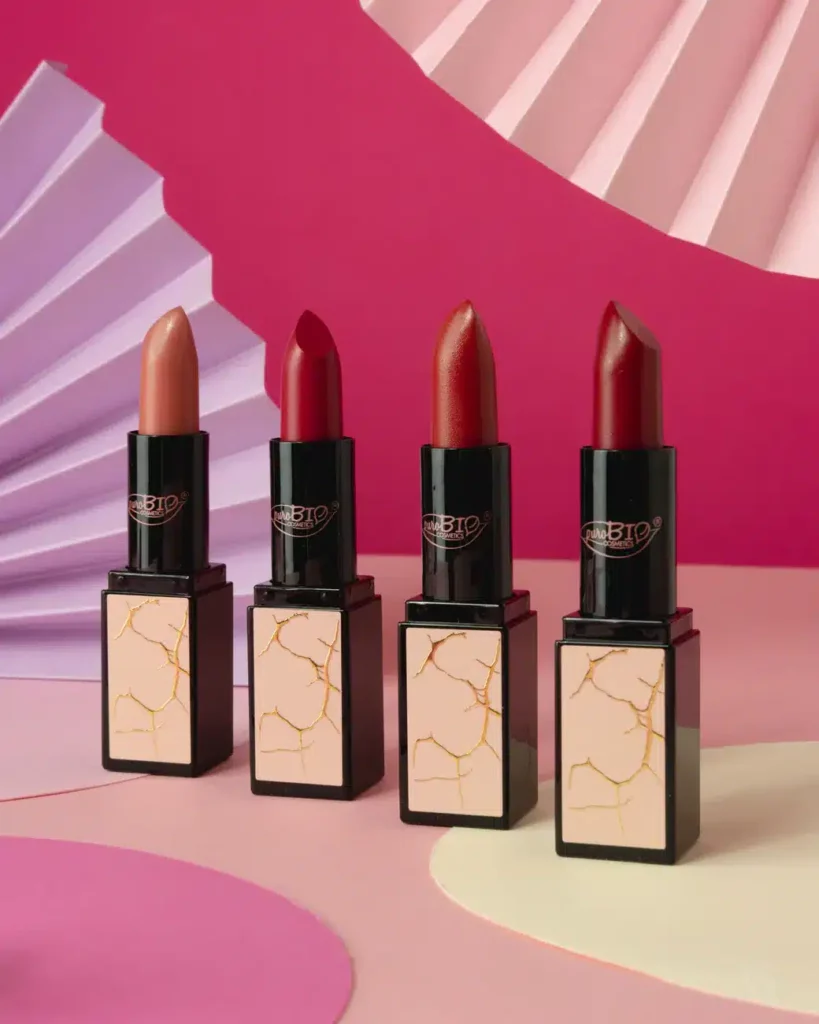
Golden cracks: The storytelling power of Kintsugi
Kintsugi is the art of repairing broken pottery with gold. Instead of disguising the crack, you highlight it. It’s resilience turned into beauty.
Luxury and beauty have already tapped into the art: Guerlain’s gilded jars, SK-II’s craftsmanship series, a make-up collection for Purobio cosmetics and even perfumes literally called Kintsugi.
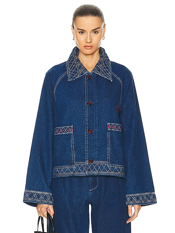
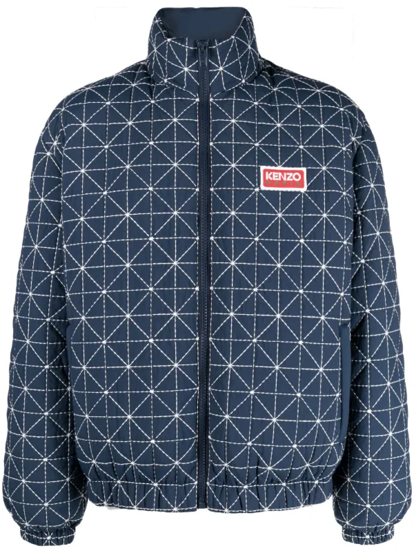
Stitches that show: Sashiko
Sashiko, literally “little stabs” (ouch !), is visible stitching used to reinforce fabric. Once purely practical, it’s now a symbol of honesty and the value of labour.
Fashion loves it (Kenzo and Bode). However, CPG has barely scratched the surface. Despite my search, I couldn’t find a single example ; so if you spot one, please share!
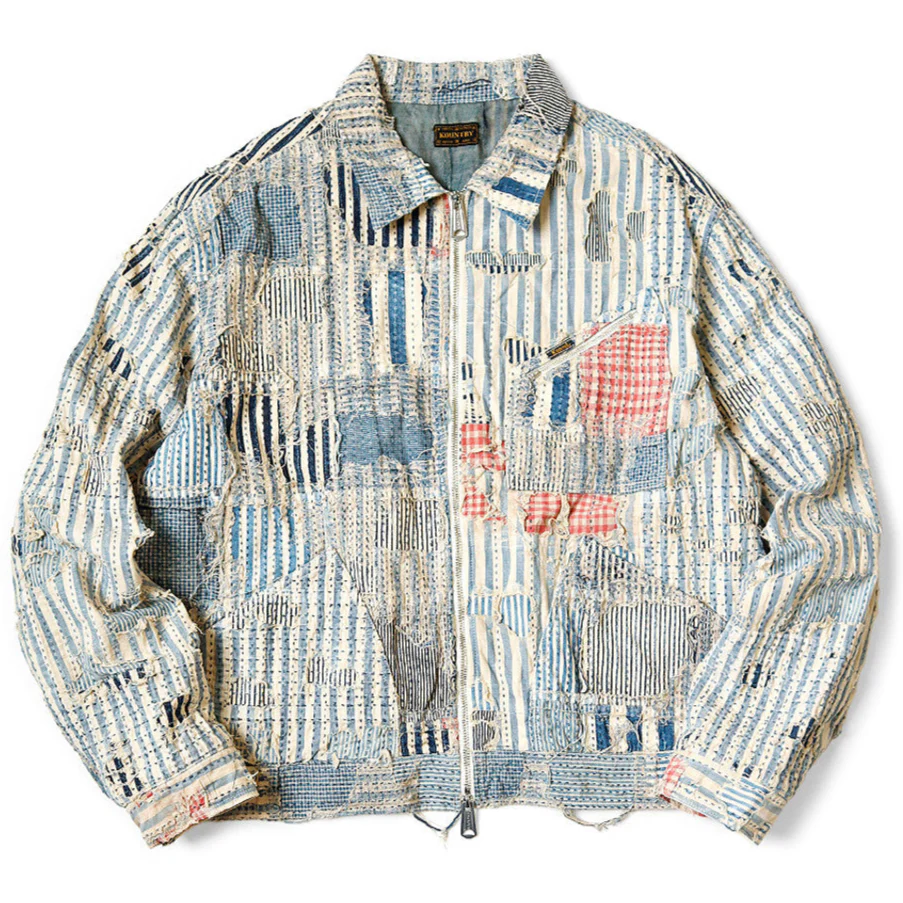
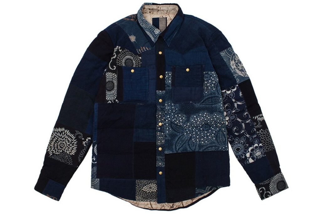
Boro as a philosophy
Borois the patched fabric itself. Historically, Japanese farmers layered scraps of indigo-dyed cloth, repairing garments again and again until they became mosaics of blue patches. “Boro” literally means ragged but in practice, it’s a textile archive of survival and care. Every patch is a story, every layered imperfection makes the identity. And it works!
Kapital and Visvim built reputations on patched jackets that turned Boro into wearable art..
I can’t help imagining how cool it could be for FMCG brands to use these cues :It would make endurance aesthetic. Patchwork-inspired packaging that layers textures or patterns And labels that show past versions beneath new graphics.
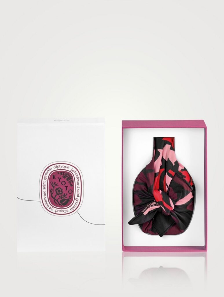
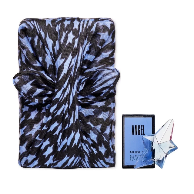
The ritual of wrapping: Furoshiki
Then there’s Furoshiki which almost everyone in the West noticed when it hit Christmas a couple of years ago. The Japanese tradition of wrapping gifts in cloth was an instant success. My first Furoshiki wrapped gift was actually from my friend Chloé after her trip to Japan nearly a decade ago.
It’s not just functional. It’s ritual and sustainability tied in one knot.
Luxury brands dabble : Diptyque’s Kyoto editions, Memo Paris perfume wraps, Tatcha’s holiday sets and also Mugler perfume (a project I worked on actually).
More affordable players too. Lush sells knot wraps as an alternative to wrapping paper. Proof that Furoshiki isn’t niche anymore: it’s a sustainable, Instagrammable ritual waiting to go mainstream.
Why Does This Matter for Brands?
Most CPG players are skimming the surface. They borrow the looks but not the philosophy. The ones who go deeper will feel more relevant, more human, and more trusted.
Wabi Sabi is a counter-move. It reminds us that beauty lives in that imperfection. That’s where brands can strike emotional resonance. Consumers are done with glossy veneers. They want truth, ritual, and resilience reflected back at them.