REGRESSIVE NOSTALGIA : The New Kidults
Kidult culture is reshaping how adults consume, decorate and emotionally cope. Across food, beauty, retail and lifestyle, brands are embracing playful design, nostalgia and softness to offer comfort in an increasingly heavy world. This article explores how regressive nostalgia moved from niche signal to mainstream strategy, why CPG leads this shift, and how emotional regulation has become a serious driver of growth.
Graphic Design Trends 2026

Every year, design holds up a mirror to culture, reflecting what we value, question and desire. Packaging, once the silent salesman, now behaves like media. It speaks, senses and connects. For FMCG and lifestyle brands, design is no longer surface decoration. It is data, emotion and identity woven into one system. Design as a Cultural […]
Consumer Behavioural Trends in 2026
Explore the top 5 consumer behavioural trends set to define 2026, including shifts away from algorithms, the rise of simplicity, and the focus on longevity
GRAPHIC CODES SHAPING CHRISTMAS 2025

Christmas 2025 arrives with a new set of visual codes: jewel-toned luxury, minimalist calm, theatre-lit nostalgia, playful kidult energy, cultural architecture and global winter aesthetics. The season’s limited editions and advent calendars signal how packaging has become cultural storytelling, shaping value and desire long before a gift is opened. This article explores the graphic languages brands are using to win the festive moment — and how CPG brands can design editions people want to keep.
The past is working overtime: How Nostalgia became a Cultural Strategy

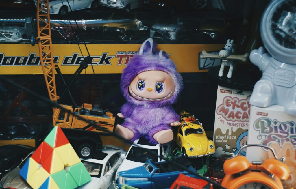
Nostalgia isn’t just a mood; it’s a marketing movement. In 2025, brands are remixing retro aesthetics, Y2K design, and childhood comfort into clever cultural strategy. From ugly-cute collectibles to vintage packaging, the past is working overtime. This piece explores how nostalgia evolved from trend to tool—and how brands can use it meaningfully without getting stuck in rewind.
Wabi Sabi : Perfectly Imperfect
Perfection is overrated. Wabi Sabi — the Japanese philosophy of finding beauty in imperfection — offers brands a way to be real, human, and emotionally resonant. From golden Kintsugi cracks to the ritual of Furoshiki wrapping, these cultural codes remind us that authenticity, not gloss, creates connection. Explore how CPG and beauty brands can move beyond surface aesthetics to embrace repair, ritual, and truth in design.
Food Imagery in Beauty: Marketing shortcut to desire
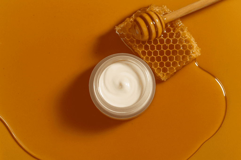
From glazed doughnuts to cherry gloss, food imagery in marketing has become the visual shortcut to craving and desire. Beauty, fashion, and FMCG brands alike are using edible cues to evoke emotion, texture, and pleasure. In this article, Intercult Brands explores how sensory storytelling and cultural codes shape appetite in design—and why one drizzle or glaze can make a product irresistible.
Longevity story for CPG’s durability

From Greek gods and golden apples to collagen drinks and biomarker gummies, the quest for longevity has always been part myth, part science. But what was once the promise of eternal youth is fast becoming a real market force across beauty, wellness, and even snacks and beverages. Today, “living better for longer” is no longer […]
Slithering into 2025: How the WOOD SNAKE inspired Brands
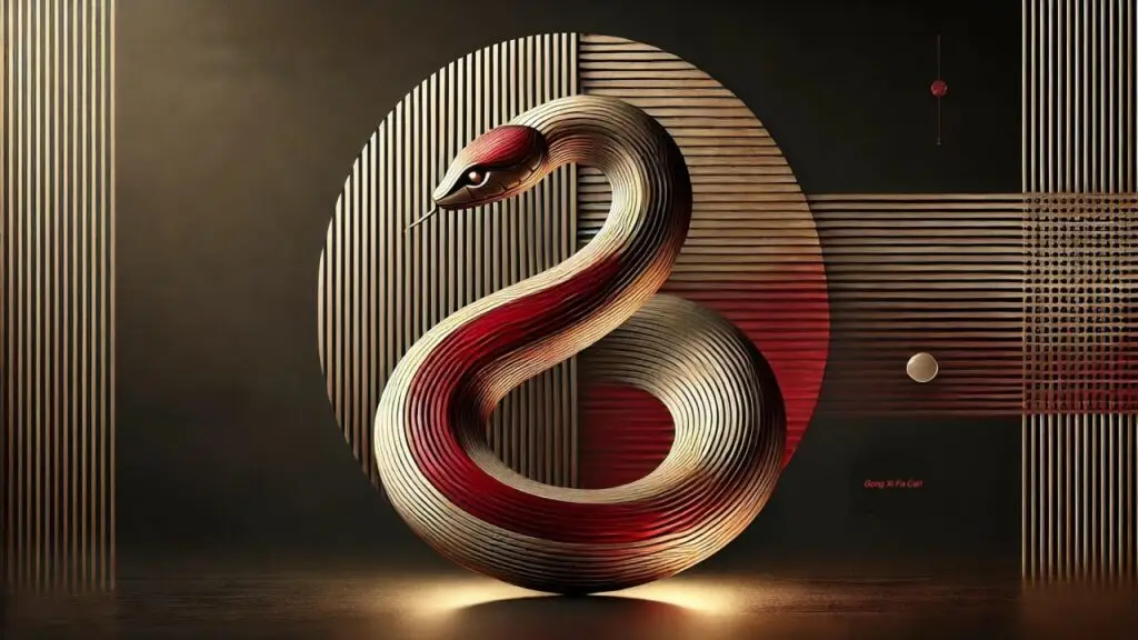
2025 is the Year of the Wood Snake, and global brands are embracing its traits: creativity, adaptability, and elegance. From serpentine patterns to luxury collaborations, design is slithering toward fluidity, mystique, and cultural intelligence.
Insights from Pentawards Festival
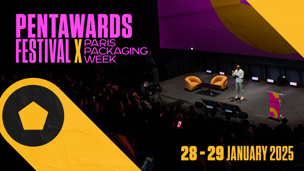
At the Pentawards Festival, design leaders revealed packaging trends for 2025. From sustainability to cultural storytelling, these signals show how packaging reflects human behavior and shapes brand relevance.