Every Christmas carries its own visual mood. Graphics become sensorial cues, a small emotional language saying gifting, theatre and the intimate rituals of generosity.
The market follows this mood closely.
Limited editions and Advent calendars
The global advent calendar industry is now estimated at around USD 1.32–1.34 billion in 2024 and is forecast to almost double by 2033, growing at roughly 8% a year. Europe still leads, but North America is accelerating fast, proving that seasonal storytelling is becoming a serious commercial category.
AI has entered the seasonal moment too. Among consumers already using AI, 57% say they’ll rely on it for gift inspiration this year. Salesforce expects AI-assisted holiday shopping to influence USD 263 billion of global sales, including USD 51 billion in the US alone. The appetite is obvious, and Christmas packaging has become a stage — a place where culture, commerce and meaning meet.
Graphic codes shaping the season.
Jewel-toned luxury and Maximalism
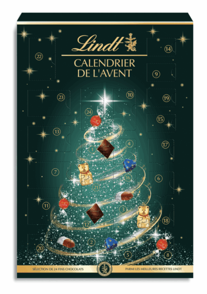
A colour story always rises above the rest. For 2025, it’s jewel-toned splendour: deep greens, rubies, sapphire blues and garnet hues that feel more like polished stones than ink. They confer value before the box is even opened. Premium confectionery makes the most of it. Ferrero Rocher keeps its gold-foil theatre, while Lindt lean into emerald.
Jewel tones behave like an instant upgrade.
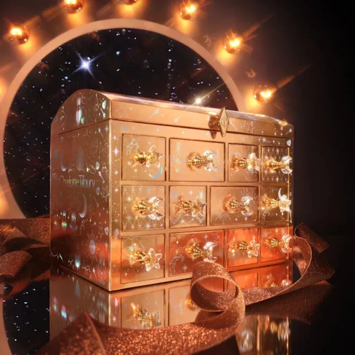
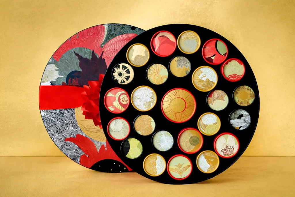
Luxury beauty interprets the code with equal drama. Dior’s Advent Calendar, a white-and-gold collector chest illustrated by Pietro Ruffo and inspired by 30 Avenue Montaigne, lands like a couture artifact. Charlotte Tilbury reaches for the celestial, creating a jewel-handled treasure chest glowing like a boudoir heirloom. At the apex sits Guerlain with “Le conte des merveilles”, a gold-and-red storybook illustrated by Mélissandre Vidal, turning every December morning into a new chapter of wonder.
Across the Pacific, Starbucks Japan transforms everyday drinkware into rhinestone talismans and jewelled blues, showing that even high-street players can master “treasure aesthetics”. Heritage brands follow suit. Villeroy & Boch takes the idea literally with a £400 ceramic-filled advent that feels like opening a dining room from 1748.
This is Christmas packaging in full glamour, indulgent and happily over the top.
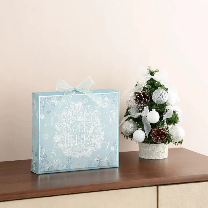
Minimal festive and Typography-led calm
If jewel tones are Christmas turned up to eleven, minimal festive is the opposite: a palette of calm. Uncoated boards, soft neutrals and small metallic gestures whisper “seasonal” rather than shout it. GLBC calls it “sophisticated simplicity”. Brands in this lane lean into quiet confidence, letting typography lead the composition. One foil star. One ribbon line. One delicate bauble.
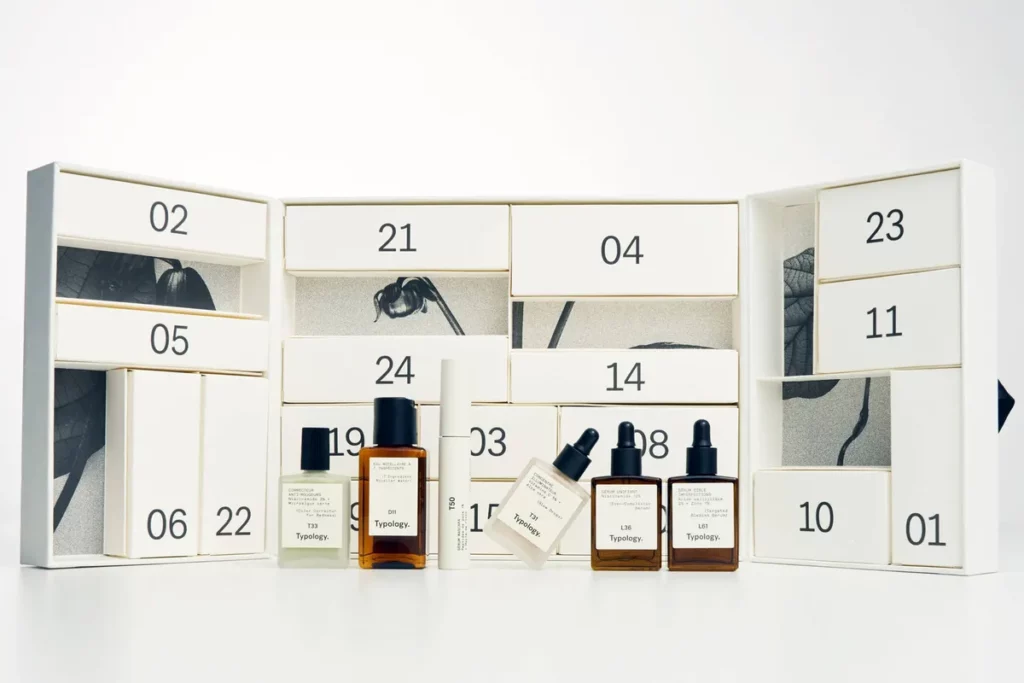
Beauty and lifestyle calendars deliver the most elegant examples. Maison Margiela’s Replica advent is almost provocatively minimal, a white box with black typography and Parisian restraint. Typology stays monochrome, apothecary, authoritative. DedCool brings LA minimalism to fragrance, while Dermstore’s full-size skincare edit sits in the same crisp design family.
Bold serif locks and oversized words elevate type into the hero graphic. Kiehl’s Advent Calendar uses a clean grid where a single “Joy” carries the festive mood. Franfranc uses a simple “Merry” on pastel tones to achieve the same effect. Here, simplicity becomes its own form of celebration.
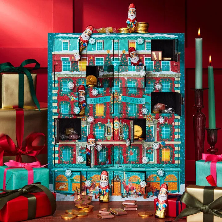
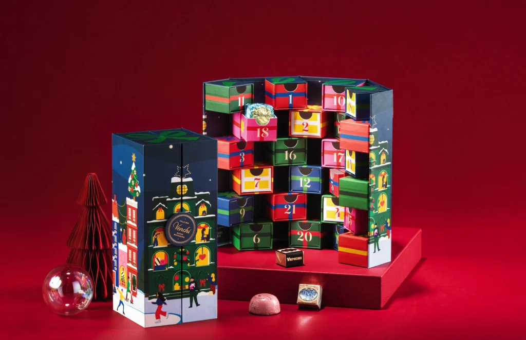
Neo-Classicism and Theatre-lit nostalgia
This is not kitsch nostalgia but classed nostalgia: old-world theatres, nutcracker ballets, harlequin diamonds and warm shop windows that feel familiar without belonging to any specific decade. Oversized bows dominate décor, and illustrated ribbons wrap boxes like trompe-l’oeil gift wrap. The old-world Christmas is re-staged for modern taste.
Fortnum & Mason and Venchi lead with wooden house advent calendars: tiny doors, detailed façades and pralines tucked behind windows that recall childhood rituals. They’re more theatrical than retro, creating storybook worlds you can hold. L’Artisan Parfumeur frames its botanique discovery set like a miniature cabinet of curiosities. OPI’s “House of OPI’cing” calendar delivers each shade with a playful, pun-soaked story
The narrative is consistent: a return to craft, ritual and the pleasure of opening something that feels like it belongs to a slower world.
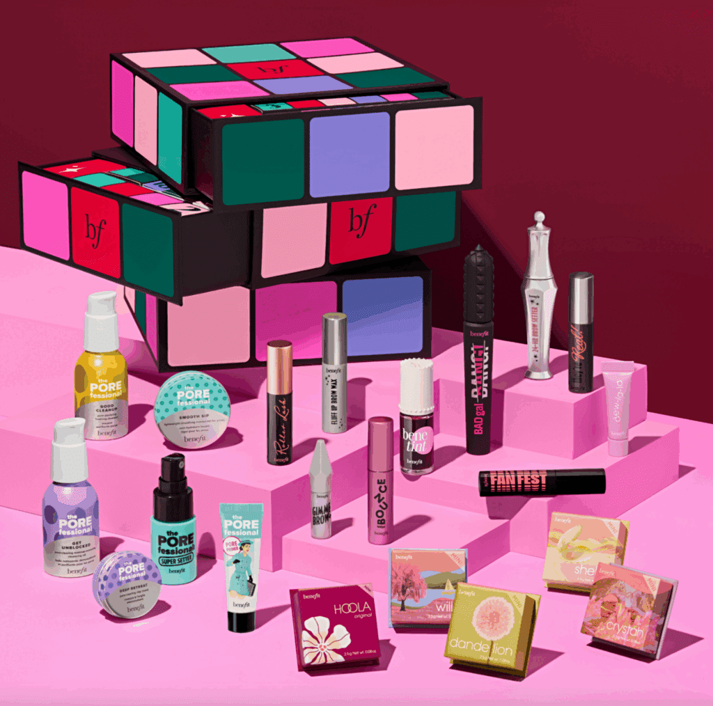
Regressive nostalgia: The playful turn
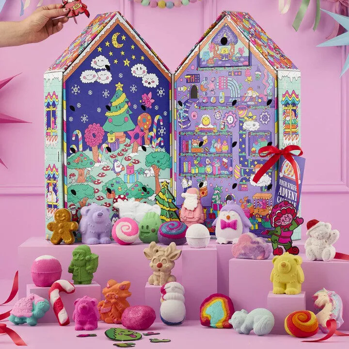
Another nostalgic current runs through 2025: lighter, cheekier and child-coded, offering comfort in an anxious world. Cadbury’s winter heroes, Twix snowmen, Urban Outfitters’ Baggu-and-Miffy-filled tween calendars, and Lush’s pop-up characters all signal the rise of kidult aesthetics.
Benefit goes full toy-box with a Rubik’s Cube–inspired advent you twist and unlock to reveal full-size surprises or mischievous minis. MoMA turns New York into a chocolate treasure map, inviting consumers to “eat” their way through the boroughs. Bonne Maman leans into cosy nostalgia with twenty-four tiny jam jars, a breakfast ritual turned festive countdown. Sisley Paris steps into full theatre through illustrations by Luke Edward Hall, delivering whimsical characters and stage-like doors for a luxury audience.
It’s playful and indulgent, a visual comfort food. It invites us back to the gleeful excess of childhood Christmas, foil-wrapped joy included.
Cultural architecture
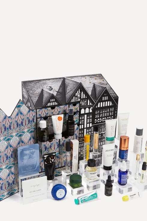
A quieter, more poetic current appears in Christmas 2025: packaging as cultural architecture. Boxes become miniature postcards, inviting consumers into places they love or dream about. The Art Deco revival plays a key role here.
Whittard’s hot chocolate calendar uses elegant geometry. Harrods’ Tea Lovers’ Calendar evokes the golden lines of an old London arcade. Liberty’s Men’s Advent Calendar is a tribute to the iconic Tudor-revival building that has shaped the store’s identity for more than a century. Quality Street continues with its candy-coloured skyline, a familiar architectural signature.
Anthropologie’s Holiday in the City calendar works as a scented love letter to the winter metropolis. In NYC, Bloomingdale’s models its 25-day calendar on the 59th Street flagship, while Saks Fifth Avenue recreates its façade as a miniature monument to Manhattan.
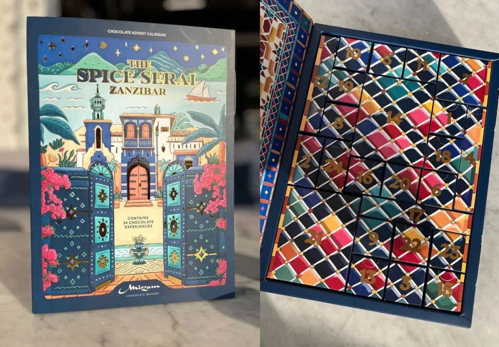
Globally, Bokksu offers a soft red wooden house that reads unmistakably as Japan, while L’Occitane reimagines a Provence mas for December. Mirzam in the UAE turns its chocolate box into a voyage across the spice route and towards Zanzibar. Even Bissinger’s pairs heritage indulgence inside with a calm, pared-back exterior.
Heritage becomes festive glamour.
December and its rather inclusive Codes
Not every country celebrates Christmas, yet many embrace December gifting. This shift has created an aesthetic that is winter-forward and Christmas-neutral: stars, night skies, geometry and soft light. It suits mixed-cultural markets and allows emotional versatility.
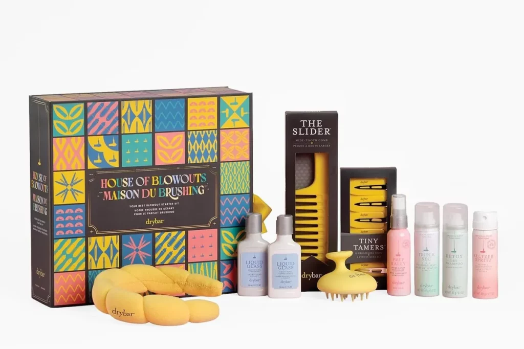
Camille Walala’s edition for After Eight captures this spirit with its bold geometry. San Francisco’s Dandelion Chocolate draws on the solar system’s twenty-five moons through artwork by Belgian artist Lina Kusaite. Scottish chocolatier Coco delivers a vibrant, fantastical palette through the work of Adam Nathaniel Furman. Myntra’s MyNykaa calendar becomes a mural of Indian palaces. Drybar’s House of Blowouts kit follows a similar logic, as does Ulta Beauty: a winter-gifting moment built entirely on brand identity.
These packs show how winter has become the bridge for global brands, allowing joy to sparkle without assuming the same seasonal calendar everywhere.
What does this mean for CPG Brands
Packaging can behave like a gift. Graphics can behave like a story. Materials can behave like memory.
Brands win when they choose their lane intentionally and understand the cultural work each code performs.
If you want your next limited edition to feel culturally intelligent, emotionally sharp and season-ready, INTERCULT BRANDS can help turn these codes into packaging that earns its place under the tree.
Let’s design the editions people want to keep.