REGRESSIVE NOSTALGIA : The New Kidults
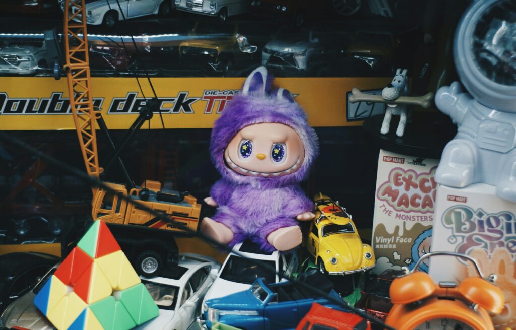
Kidult culture is reshaping how adults consume, decorate and emotionally cope. Across food, beauty, retail and lifestyle, brands are embracing playful design, nostalgia and softness to offer comfort in an increasingly heavy world. This article explores how regressive nostalgia moved from niche signal to mainstream strategy, why CPG leads this shift, and how emotional regulation has become a serious driver of growth.
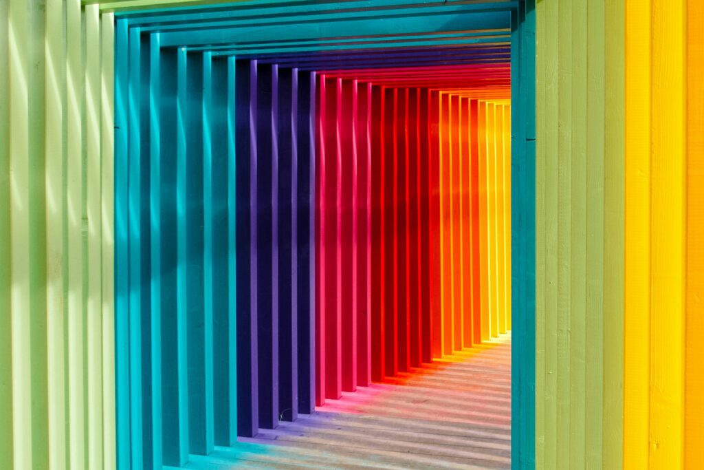
Graphic Design Trends 2026

Every year, design holds up a mirror to culture, reflecting what we value, question and desire. Packaging, once the silent salesman, now behaves like media. It speaks, senses and connects. For FMCG and lifestyle brands, design is no longer surface decoration. It is data, emotion and identity woven into one system. Design as a Cultural […]
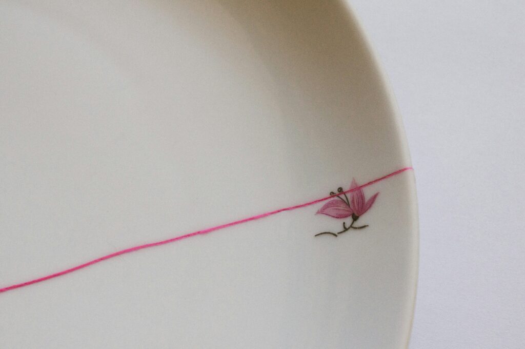
Branding & Packaging designs live in cultural margins
Great branding is rarely about what shouts the loudest. It’s about what’s felt in the margins. The space around a logo, the weight of a material, the tone of a colour that lands differently from one culture to another. In a globalised world, design meaning is never universal. Colours, symbols, typography and even silence carry […]
GRAPHIC CODES SHAPING CHRISTMAS 2025

Christmas 2025 arrives with a new set of visual codes: jewel-toned luxury, minimalist calm, theatre-lit nostalgia, playful kidult energy, cultural architecture and global winter aesthetics. The season’s limited editions and advent calendars signal how packaging has become cultural storytelling, shaping value and desire long before a gift is opened. This article explores the graphic languages brands are using to win the festive moment — and how CPG brands can design editions people want to keep.
Wabi Sabi : Perfectly Imperfect
Perfection is overrated. Wabi Sabi — the Japanese philosophy of finding beauty in imperfection — offers brands a way to be real, human, and emotionally resonant. From golden Kintsugi cracks to the ritual of Furoshiki wrapping, these cultural codes remind us that authenticity, not gloss, creates connection. Explore how CPG and beauty brands can move beyond surface aesthetics to embrace repair, ritual, and truth in design.
Slithering into 2025: How the WOOD SNAKE inspired Brands
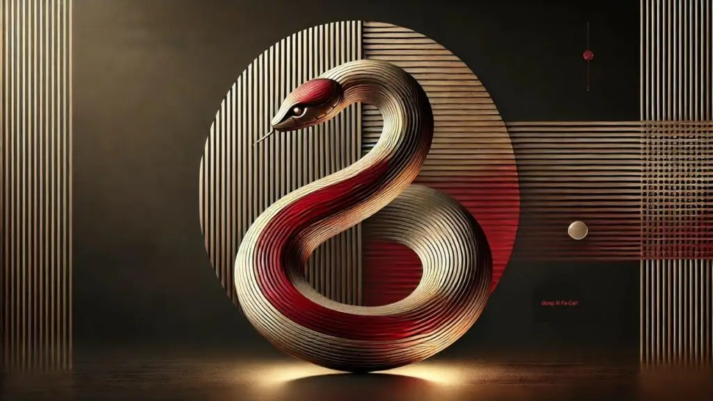
2025 is the Year of the Wood Snake, and global brands are embracing its traits: creativity, adaptability, and elegance. From serpentine patterns to luxury collaborations, design is slithering toward fluidity, mystique, and cultural intelligence.
Insights from Pentawards Festival
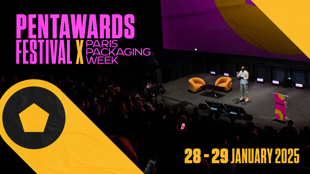
At the Pentawards Festival, design leaders revealed packaging trends for 2025. From sustainability to cultural storytelling, these signals show how packaging reflects human behavior and shapes brand relevance.
Design gets delicious: Pantone Mocha Mousse 2025
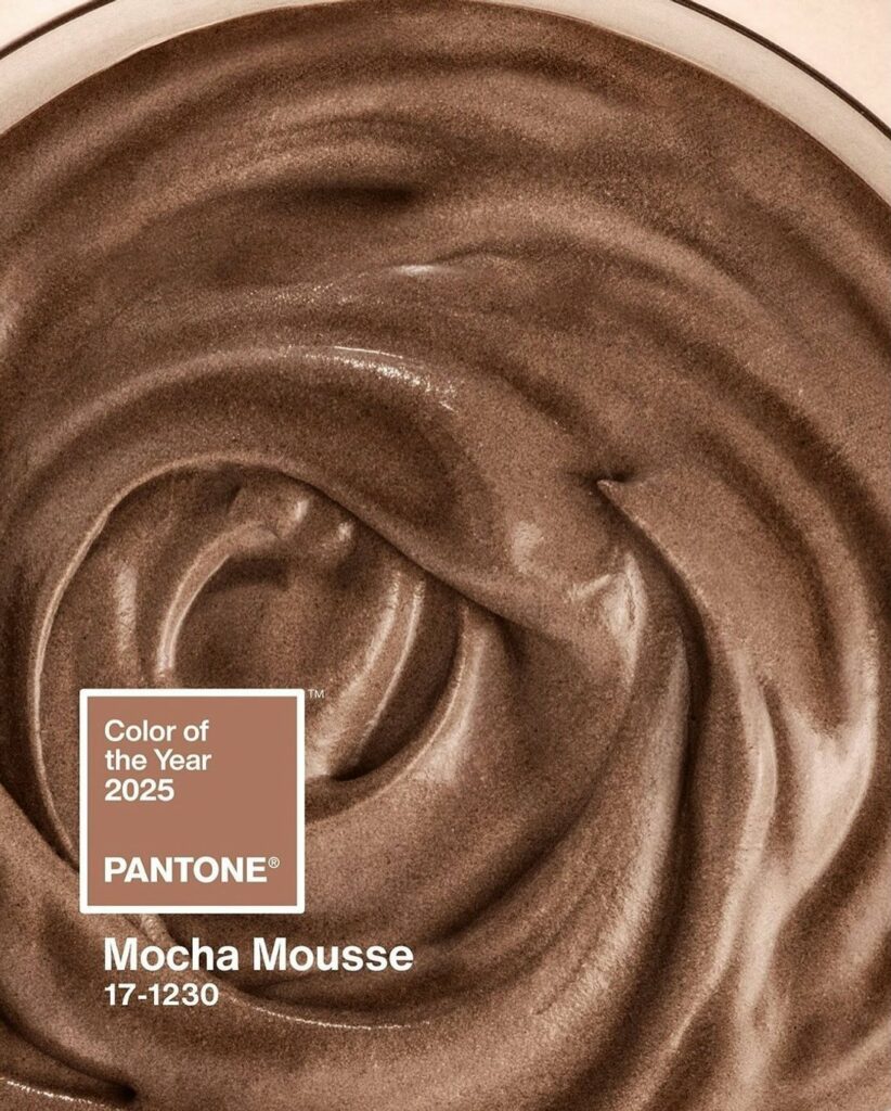
Pantone Mocha Mousse isn’t just a color—it’s a mood, a flavour, and a cultural cue. The 2025 Color of the Year captures our craving for warmth, comfort, and sensory pleasure. From Motorola’s coffee-infused tech to Tealeaves’ chocolate-inspired blend, Pantone Mocha Mousse is showing up across fashion, design, and wellness as a symbol of indulgence and balance. This hue translates the softness of suede and the richness of espresso into a visual language of calm sophistication and slow-living luxury.