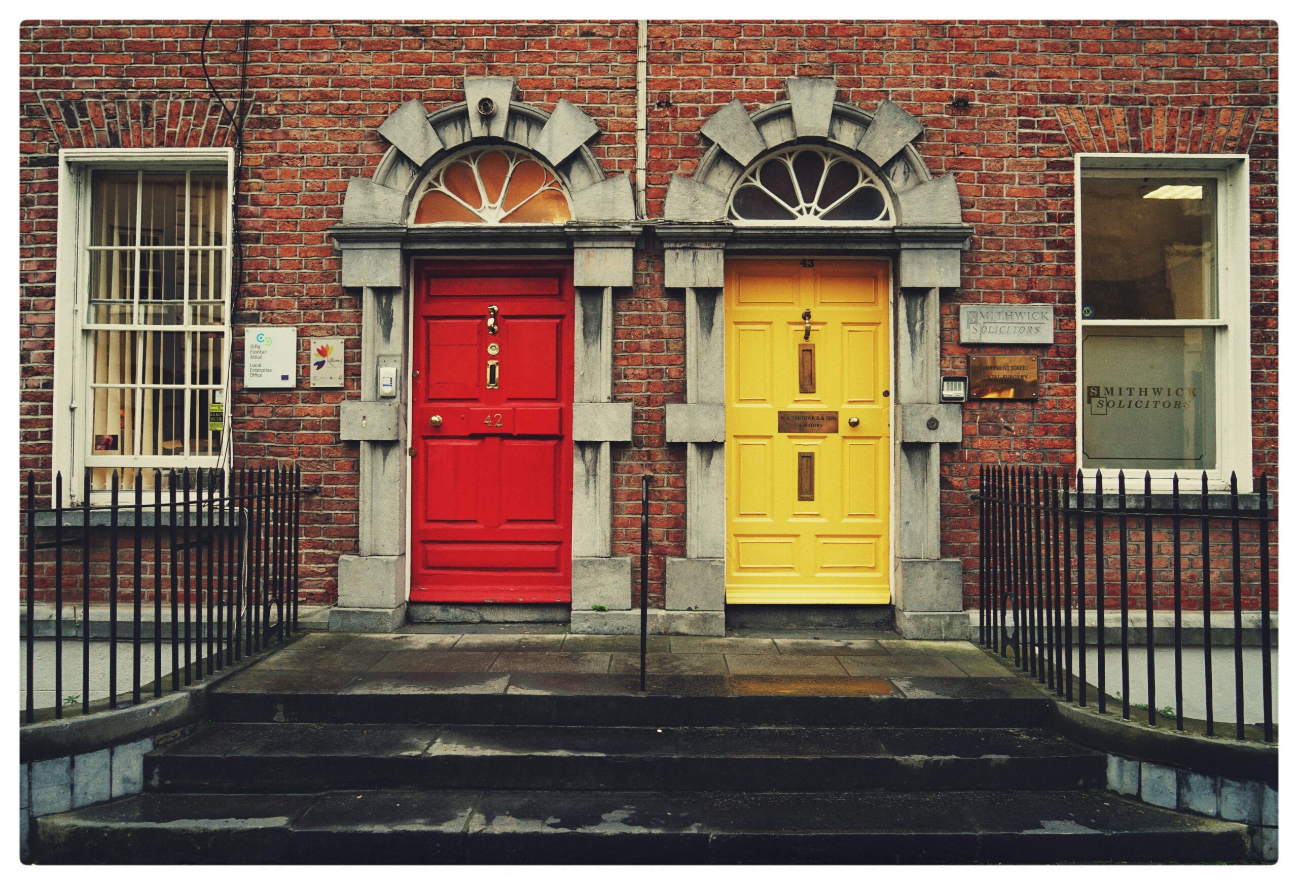
Great branding is rarely about what shouts the loudest. It’s about what’s felt in the margins.
The space around a logo, the weight of a material, the tone of a colour that lands differently from one culture to another.
In a globalised world, design meaning is never universal. Colours, symbols, typography and even silence carry cultural codes that shift across geographies, generations and subcultures. What reads as premium in one market can feel cold, outdated or even inappropriate in another.
In this article, INTERCULT BRANDS explores how nuance, semiotics and cultural fluency shape branding and packaging design today and why the most resilient brands are the ones that know how to adapt without losing coherence.
👉 Read the full article on LinkedIn
https://www.linkedin.com/pulse/branding-packaging-designs-live-cultural-margins-intercultbrands-ioxje/


